 ×
×
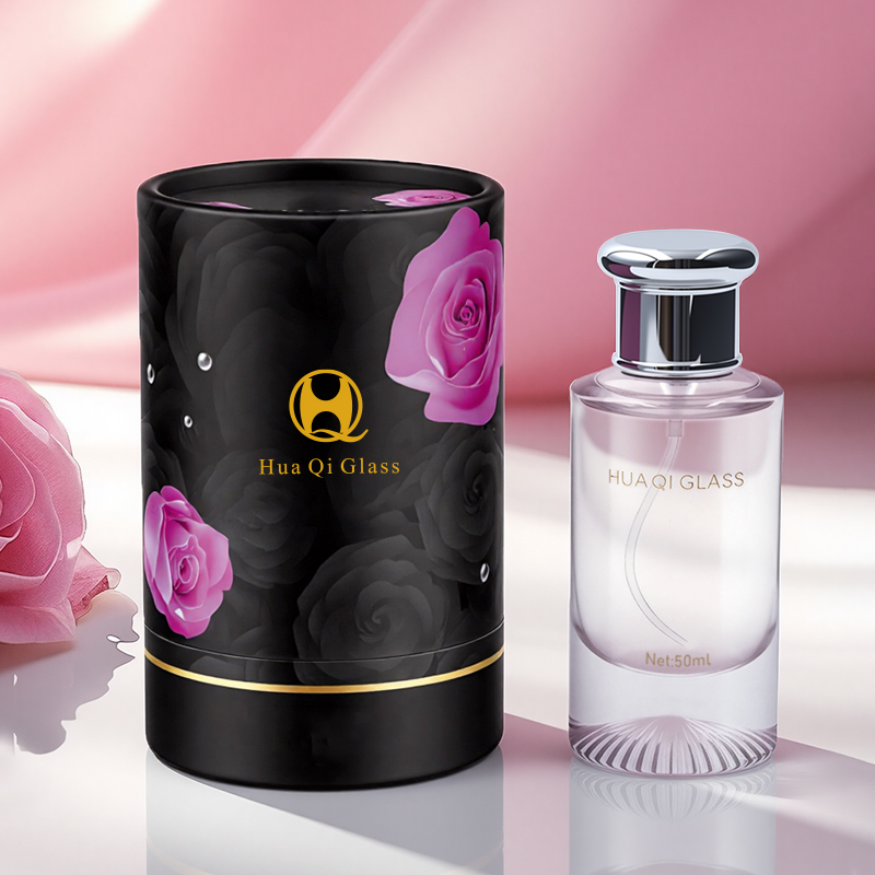
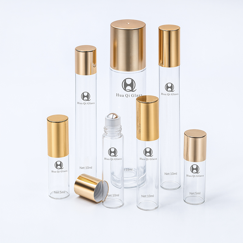
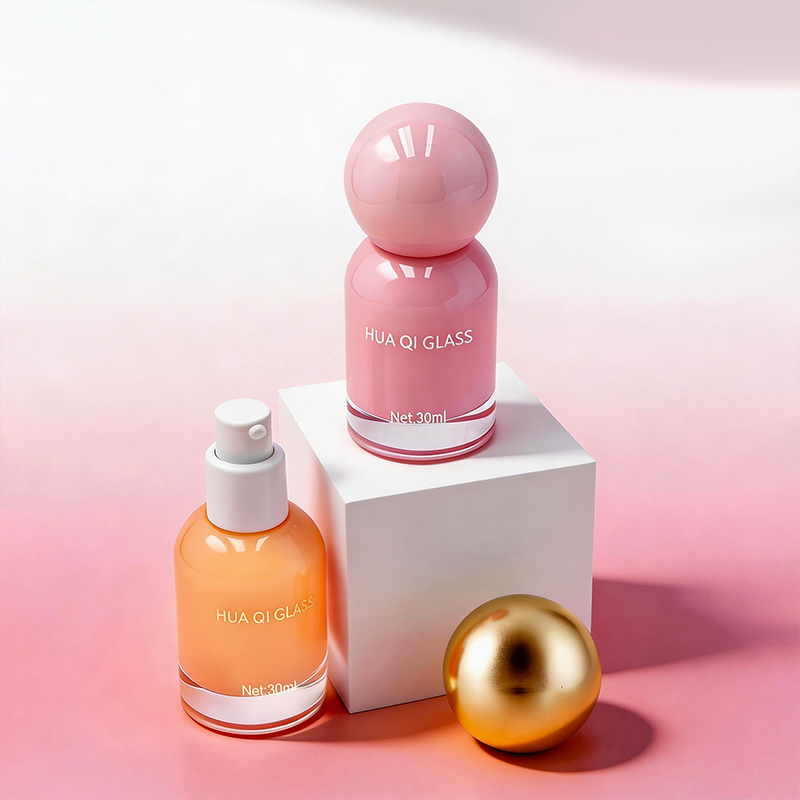
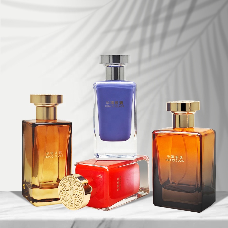
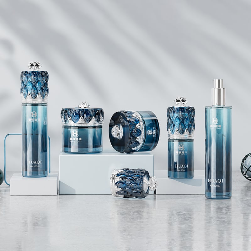
Visual consistency turns cosmetic bottle sets into strong brand markers that stand out on crowded shelves. Bottles with matching proportions like similar tapers or consistent shoulder angles form recognizable patterns at a glance. The same attention to detail carries over to how they feel in hand too. Matte finishes often give off a premium, minimalist vibe, whereas glossy ones tend to look more lively and energetic. Bottle height actually matters psychologically speaking taller containers usually scream luxury skincare products while smaller ones naturally suggest something portable for travel. Brands that repeat these design choices consistently see better results in customer memory tests. Studies indicate packaging that stays the same across product lines can boost brand recall by nearly half versus mixed designs. What this creates is a cohesive line of products that acts as branding ambassadors everywhere they appear from store displays to online listings.
Beyond basic branding, your cosmetic bottle set becomes a strategic canvas for expressing core values through three integrated levers:
Color Psychology Implementation
Pantone-matched hues trigger precise emotional responses—deep blues reinforce trust in clinical formulations, while botanical greens strengthen natural positioning. Limited-edition metallics can signal exclusivity without mold retooling.
Mold Engineering for Distinctiveness
Custom tooling creates proprietary shapes that serve as intellectual property assets. Fluted grips improve ergonomics, and unique cap contours deter counterfeiting—a critical concern, as packaging imitation costs brands $740k annually (Ponemon Institute, 2023).
Surface Narrative Techniques
Laser-etching sustainability certifications directly onto glass—or embossing logos—turns functional surfaces into storytelling platforms. Soft-touch coatings enhance perceived value, supporting justified premium pricing.
This multi-sensory alignment ensures every interaction—from first shelf encounter to daily use—reinforces your brand ethos.
High end cosmetic bottles depend on smart engineering to keep products fresh and make them easier to apply. The airless pumps are really important because they stop oxygen getting in, which is a big deal for things like vitamin C serums and retinol products. According to some research published last year, around three-quarters of these ingredients lose their effectiveness just from sitting exposed to air. Then there are those precision droppers that give out exactly 0.05ml each time. This means people don't waste as much product compared to regular dispensers, cutting down waste by about 30%. Many brands now offer refill options too, either through magnetic closures or screw-on inserts. This lets customers fill up their favorite containers again and again without having to buy entirely new ones every time. Plus, the design stays consistent throughout different product lines. All these little innovations mean packaging isn't just something we put products in anymore it actually helps protect what's inside.
When it comes to product design, ergonomics isn't just about looks versus function anymore. It's really about creating something that feels luxurious but works reliably too. Take those contoured shapes we see so much these days. The 12 to 16 mm grip diameters fit all sorts of hand sizes and stop things from slipping out when someone needs them most. According to Packaging Ergonomics Study from last year, around two-thirds of people actually care about this stuff in their everyday lives. The way manufacturers balance heavy glass parts with lighter metal lids makes single-handed use possible without dropping anything. Those little ridges on surfaces? They make a big difference when dealing with thick products that want to stick together. And let's not forget about those angled tips and narrow openings at the end. These are designed specifically to match how our wrists naturally move, which matters a lot for delicate applications such as applying eye serums where even minor discomfort can ruin the whole experience. At the end of the day, good ergonomic design turns ordinary activities into something worth enjoying rather than just getting through.
Cosmetic bottle sets today are moving toward using PCR resins and single material designs as brands try to satisfy growing environmental concerns without hurting product quality. These PCR materials come from old consumer waste and can cut down on new plastic usage by around 80% according to Sustainable Packaging Coalition data from last year. The other big trend is mono-material construction like all PET components which makes recycling much easier for consumers. But there are real-world problems too. Companies find that PCR resins sometimes cause issues with color matching across batches. And when making lighter weight bottles from single materials, engineers have to work extra hard to keep the packaging from letting air in that could spoil ingredients over time. Shelf life stays absolutely essential though. Testing shows that getting the right wall thickness combined with specific polymer mixtures helps stop products from going bad before their expiration date. Ultimately what matters most is finding the sweet spot between being able to recycle easily, looking good on store shelves, and keeping contents safe until they're used up.
Visual consistency makes bottle sets stand out on shelves, improving brand recall and identity by forming recognizable patterns and appealing to customer psychology.
Color psychology uses hues to trigger emotional responses, while mold engineering creates proprietary shapes, aiding in uniqueness and adding intellectual asset value.
Airless pumps and precision droppers preserve product freshness and reduce waste, ensuring effectiveness and efficiency in application.
Sustainable materials reduce plastic usage, improve recyclability, and protect product integrity, meeting environmental concerns while maintaining quality.
 Hot News
Guangdong Huaqi Packaging provides premium cosmetic glass bottles, perfume bottles, and custom caps for global beauty brands. ISO9001/REACH certified, 8000+ molds, 95% repeat orders. Request OEM/ODM quote today.
Room 416, 4th Floor, Building A, Enterprise Service Center, No. 1 Guangzhou Road, Guangzhou (Qingyuan) Industrial Transfer Park, Shijiao Town, Qingcheng District, Qingyuan City
Copyright © Guangdong Huaqi Packaging Products Co., Ltd. --Privacy Policy